
The model comparison seen above was built in conjunction with a code along course from coursera, “Compare time series predictions of Covid-19 deaths” with Coursera. It’s an analysis of global daily deaths reported from the Johns Hopkins database which modeled deaths up through August. I amended the dataset to focus solely on the U.S. and the daily prediction of U.S. Covid-19 fatalities with dates extended through the start of December. As we can plainly see, neither model contained a strong correlation and prediction result. These time series predictions were made by applying prior U.S. trends from the beginning of the pandemic and as we now know, the spike in November was a material divergence in its trend. In fact, the November period witnessed an exponential rise (which deviated substantially from the summer months). It should be noted that the summer time period in the analysis tracked fairly well and coincided with the publication of this course. However, by the time I enrolled and updated the data to incorporate the recent fall months, the relationship clearly broke down.
The analysis that follows substantially improved the forecasting result and is an important reminder that incorporating domain expertise can make a signification difference when applying different models.
It was during this time that I came across the work done by the Delphi Group at Carnegie Mellon as highlighted in the November article of The Atlantic, titled “How many Americans are about to die?”.
This article introduced me to some of work done by the forecasting expert Ryan Tibshirani of the Delphi Group. In particular, I was inspired to review an alternative method to predict the daily death toll from the tracking of confirmed cases. The forecasting method involves calculating a case fatality ratio(CFR) from a lagged time series of covid-related deaths. That is, the ratio of deaths to the confirmed cases on a percent basis. Over the course of this post, I’ll investigate the CFR and the appropriate ratio to apply given a correlated lag in days between the confirmed cases and the resulting deaths.

As we can see above, the resulting death ratio fell precipitously until the middle of the summer as the result of a falling daily death total and a divergent spiking confirmed covid case rate. Those confirmed cases began to jump mid June while the daily death toll lagged behind by nearly a month, presumably because of greater testing and easing of restrictions around the country.

These factors led to the false predictions made in the initial analysis. While certainly an issue with many early stage time series models is their lack of sufficient data, it was also an error in how this pandemic was progressing among many other issues related to societal regional behavior across the country.
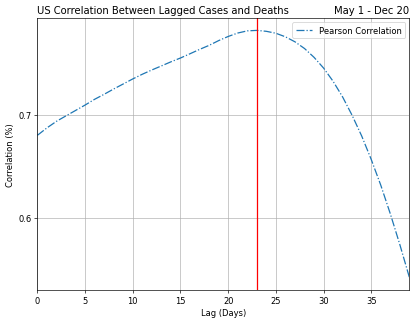
In order to apply this CFR ratio to the analysis, we first needed to select the appropriate rate and lag that yielded the smallest mean absolute error(MAE).

The 1.6 CFR curve appears to have the lowest MAE at a lag of 20 days. We will work with those parameters in our predictions. First let’s have a look at how the Delphi Group viewed the dataset through their time frame up to Nov 15th (have their metrics held true beyond November?)

For our analysis, since we’ve seen case fatality ratios trending up, we’ll apply the latest CFR of 1.6% (which is higher than the average of 1.45% since the July) to forecast across a few lag scenarios:
- 16 days(the shortest lag found by Delphi),
- 20 days(my lowest error)
- 24 days into the future which was the longest lag to display a significant correlation.
Lets first review the forecast result of our 20 day lag result with a CFR of 1.6% as a baseline comparison:


By January 14th, this model was forecasting the US death rate from Covid-19 to eclipse 400,000. A sobering number and statistic that on a personal note deeply affected my family shortly after completing this study. Sadly my father-in law passed away from complications related to Covid this past January. When I began this analysis, my goal was to understand the forecasting of an exponential growth pattern of a virus impacting our livelihood and daily life, but it’s impact on my family has made this analysis and proximity of this virus so much more tangible. My hope to those that read this post is that it serves as an alternative approach to understanding the trends of a complicated environment but more importantly that you and your families remain safe and well.
