As a follow up to the Fixed Income volume regression post, below is a time series analysis which improves upon that by not only incorporating exogenous input factors but adds a seasonal element as well. The inherent flaw in many regression models is that it’s statistical properties, or linear relationship among the variables must persist over time and that’s not the case with non-stationary time series. In a time series problem, for example, an ARIMA model can account for this issue. After determining the trending and seasonal nature of this time series, we could materially reduce our forecasting error and yield a far more robust forecasting model than the multiple linear regression.
As with the prior post, the customer names and respective data has been anonymized for publication purposes.
Recall, the purpose of this project was to forecast the time series of customer fixed income volumes. The settlement of these securities generates fees and is therefore correlated to the activity or volume in these respective markets. Therefore, the ability to forecast these volumes and indirectly the fee revenue can provide helpful insights for much of the business such as budgeting and capital allocation.
After cleaning and transforming the daily set to a weekly time series.

Upon running a seasonal decomposition, there’s some evidence of seasonality. As we can see below, during end of December and early January trading the time series exhibits a steep drop off which makes sense given the holidays. We’ll likely want to incorporate that into our model.

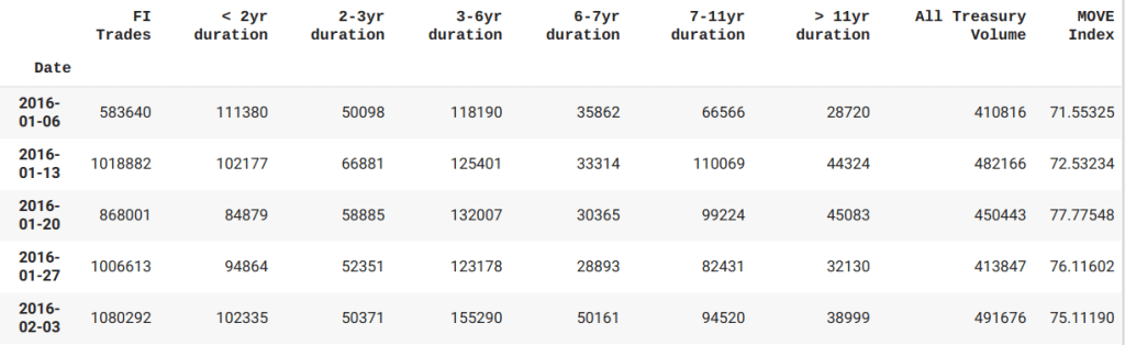
Before we dive into a complex model, let’s first examine some other features in the dataset. Below we’ve aggregated the dataset to include the MOVE Index( Treasury volatility index) as well as the primary dealer activity(includes duration series from short term maturities to longer dated matures and I aggregate those into the ‘All Treasury Volume’ column) that gets reported to the NY Fed weekly. We need to align each series for comparison to produce a table of features for comparison.
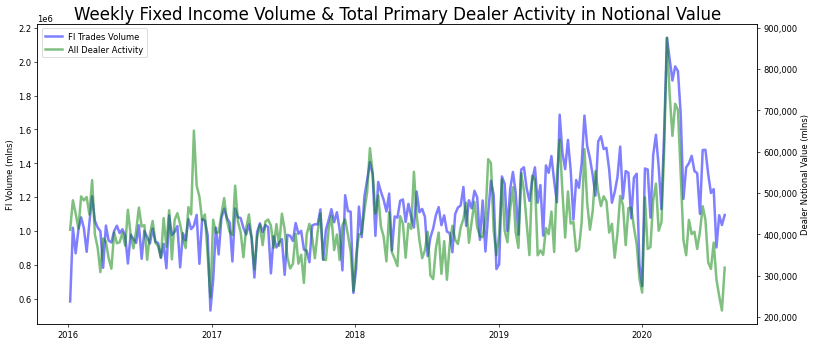
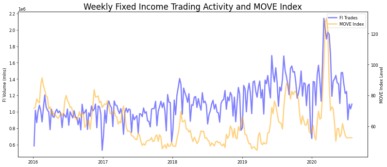
In order to determine which feature works best with our time series, I looked at the chart comparisons of both the primary dealer activity(aggregated as the All Treasury Volume series) and the MOVE Index.
When comparing time series data sets it’s imperative to check for stationarity, since a constant mean and standard deviation will allow us to make predictions. After reviewing all three time series, it’s our original series that was exhibiting this given the results of a dickey-fuller test.

We can correct for this by applying differencing transformations and that can be done in a few ways. Aside from manually calculating numpy differencing to the dataset, we could also view the autocorrelation distribution plots (ACF) to or run the auto_arima function from the Pyramid library.
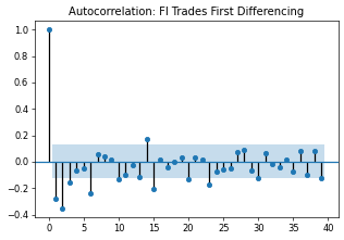
This plot below indicates non-stationary data, as there are a large number of lags before the ACF plot values drop off and fall into the shaded region.

We can visually inspect from the partial auto correlation (PACF) plot that a First Difference lag can transform the Trading series into a stationary one for further analyzing.
Another way to understand our dataset and more efficient is to run the auto_arima function. This provides more concrete detail on how we should model this series. Running an auto_arima function would be more efficient if not more precise and help us to compare an ARIMA(Auto Regressive Integrated Moving Average) model to that of the seasonal SARIMA model.
While there’s a lot more detail to provided, I’m going to focus on the AIC score(Akaike Information Criteria). As I tweak the model for better performance, we want to see the AIC score shrink, indicating improvement to our error. Recall we were also interested in the level of seasonality in this dataset. A SARIMA model should perform better if that’s the case.
#Run ARIMA model to compare AIC score to SARIMA
auto_arima(weekly_df['FI Trades'],seasonal=False).summary()
In the code above, we set the seasonal parameter to False to produce an ARIMA model. Despite that, the module lists title as SARIMAX however as we can see along side the model description, the parameters do not reflect the seasonal metrics in the subsequent models, not yet anyhow and I’ll get to that shortly.

#Seasonality on a weekly time series.
auto_arima(weekly_df['FI Trades'],seasonal=True,m=52).summary()
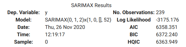
Given the improvement, albeit modest in terms of an AIC score as well as the seasonal impact we detected in our graphs, we’ll choose to work with the SARIMA model for now.
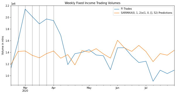
The following chart compares the last 12 months of our trading activity to the of the SARIMA model trained of our 4+years dataset with the exception of this last period that we’re using for testing.

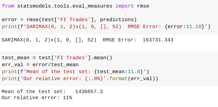
As we can see from the chart, the first couple months the model didn’t track very well. In fact, it completely failed to capture the spike in activity potentially indicating an exogenous feature contributing to the original data. This period clearly hurt our error performance. Our rmse(root-mean squared error) is 24% of our average value, meaning that’s how far off on average our model could be at any given point.

Let’s review the MOVE Index and the Primary Dealer volumes as potential exogenous contributors to our performance. One approach is to look at the Granger Causality to see if these data sets potentially impact our fixed income trading activity. I ran a few lags on each feature and if they line up with a low p-value(the smaller the p-value, the stronger the evidence that we should reject the null hypothesis for a non-informative relationship) they could be useful in reducing our error and improving our forecasting.
The MOVE Index at lag 2 and lag3 indicates there’s some benefit.
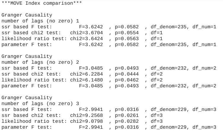
The Primary Dealer data showed causality as well., possibly more so with just 1 lag.

From overlaying the MOVE Index onto our trading volume time series(see the grey vertical lines), we an see where it could add improvement, particularly when there were spikes in the MOVE Index such the first two quarters for 2020.
We can see some improvement in our model as the rmse error dropped by 30%.
Next we rebuilt the model to incorporate the primary dealer activity and this reflected a 50% improvement to our error score. This is also obvious in our graph as well.

This looks pretty good. Next we’ll make some predictions after we fit the model for our entire data set. With the data set ending in July of 2020, let’s take a look at the 6-month forecast through end of what could be a volatile year.

